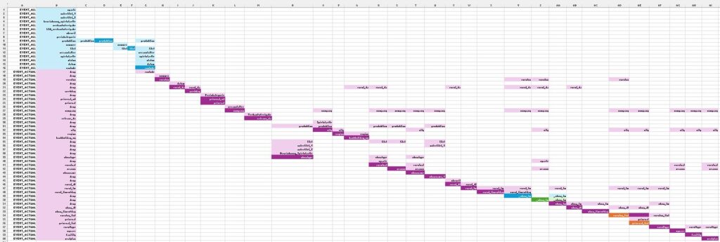
This visualization can help you clarifying and improving the program flow. Excel is not the best software to visualize your mapping, but it could be a first place to start with using the link between input and output variables. Here is an example with two mapped datasets.
Visualizing Two Datasets
- EVENT_ALL (first few rows in blue) and
- its derived dataset EVENT_ACTUAL (the rows below in purple).
Visualizing Input and Output Variables
For the other columns, we have two types of background color:
- The dark background colors are used to highlight output variables.
- The light background colors are used for the input variables.

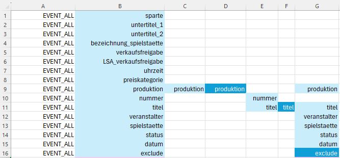
Let’s start by zooming in on the top left corner in order to understand how the mapping is specified.
1. First Dataset, Basic Visualization Concept
Unchanged Variables
sparte, untertitel_1, etc.). Updating an Existing Variable
produktion is the first modified variable. Special apostrophes with standard apostrophes. But to know the kind of transformation, you would need to look at the code. It is not mentionned in the visualization. 
Updating a Variable using Another Variable
titel variable is modified. In addition to apostrophes changes, hard coding is necessary for specific events. These events are identified with their number (nummer variable). Basically, terms such as “Premiere” that were forgotten in the database are added, in order to have all the details in the final report.
Creating a New Variable
exclude variable from the updated produktion and titel variables and the veranstalter (organizer), spielstaette (venue), status, and datum (date) variables. In Summary
This initial overview gives you a rough idea of the method used to present the variable mapping.
And now let’s have a look is the first part of the mapping for the second dataset.
2. Second Dataset - Using one Data Step
This part of the mapping is done in a single data steps.
Here are a few examples:
- The variable
excludeis only used to select specifc rows from the input dataset. It is dropped from the output dataset. - The variable
nummeris renamed toeventno. - Two variables are derived from the
preiskategorievariable. - The variable
showtypeis created using five input variables. - The derived variable,
city, created from three variables, is used to create theregionvariable.

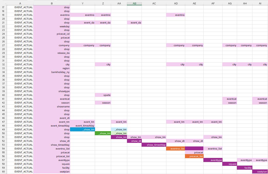
3. Second Data Step - Merging using Intermediate Datasets
And finally, here is the second part of the mapping for the second dataset.
Merging Two Datasets to the Main Dataset to Add One Variable
First notice the different colors, blue and green. Two intermediate datasets were created from the variables in the main dataset, each having a new variable.
The variable _show_tm in this first intermediate dataset (blue) requires the variables eventno (event number), event_da (event date), company, event_tm, and event_timeofday to be created. Similarly, the second variable _show_tm in this second intermediate dataset (green) use multiple input variables.
The main dataset (purple) is then updated with the two intermediate datasets to create the show_tm variable.
Merging one Dataset to the Main Dataset to Add Two Variables
Now let’s move on to the orange background. This third intermediate dataset, created from the main dataset, has two new variables, eventno_list and pricecat_list.
The main dataset (purple) and this third intermediate dataset (orange) are merged in order to add the variables eventno_list and pricecat_list to the main dataset.

eventtype needs the variable eventno_list to be created, but it is not the case of the the other variables (square, facility, and seatplan). They could have been added much earlier in the program, even before working with the intermediate datasets. Conclusion
This kind of mapping can be useful to have a quick understanding of the program. It can help improving the program flow and support the validation process.
Althgouth I’ve used a SAS program to illustrate the purpose, it can be implemented whatever the programming language used.
However, as you mentionned above, it was done manually. Any change in the program has to be implemented manually in the visualization. A tool able to generate such kind of output automatically would be needed to generalise its use in a department. Do you have any suggestion?
